Relaunch of the corporate website of IT service provider GFT Technologies
CLIENT
GFT Technologies SE
YEAR
2015
AGENCY
Aperto
Challenge
GFT is an international IT financial services provider that employs more than 2.000 people at 32 locations. GFT mainly develops software solutions and counts the largest banking houses among its customers. Aperto was commissioned to create a fully responsive corporate website whose visual design represent the intangible, complex and abstract services in a contemporary manner.

The key visual
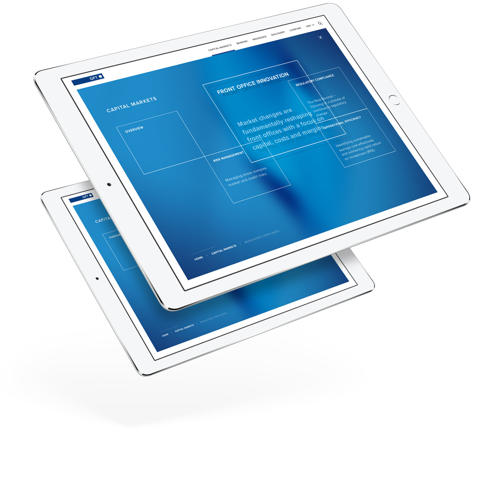
Together with the client and an external motion design agency, Aperto has created a new key visual. It enhances the existing corporate design and transports the core brand values of GFT. The basis of the animation idea arise from the core parameters of GFT’s work: time and transformation. In Addition we invented the linear inter sectors, that can divide the moving object to create new parts and reflective areas. The key visual has been used not only in digital media, but also in print and on trade fairs.

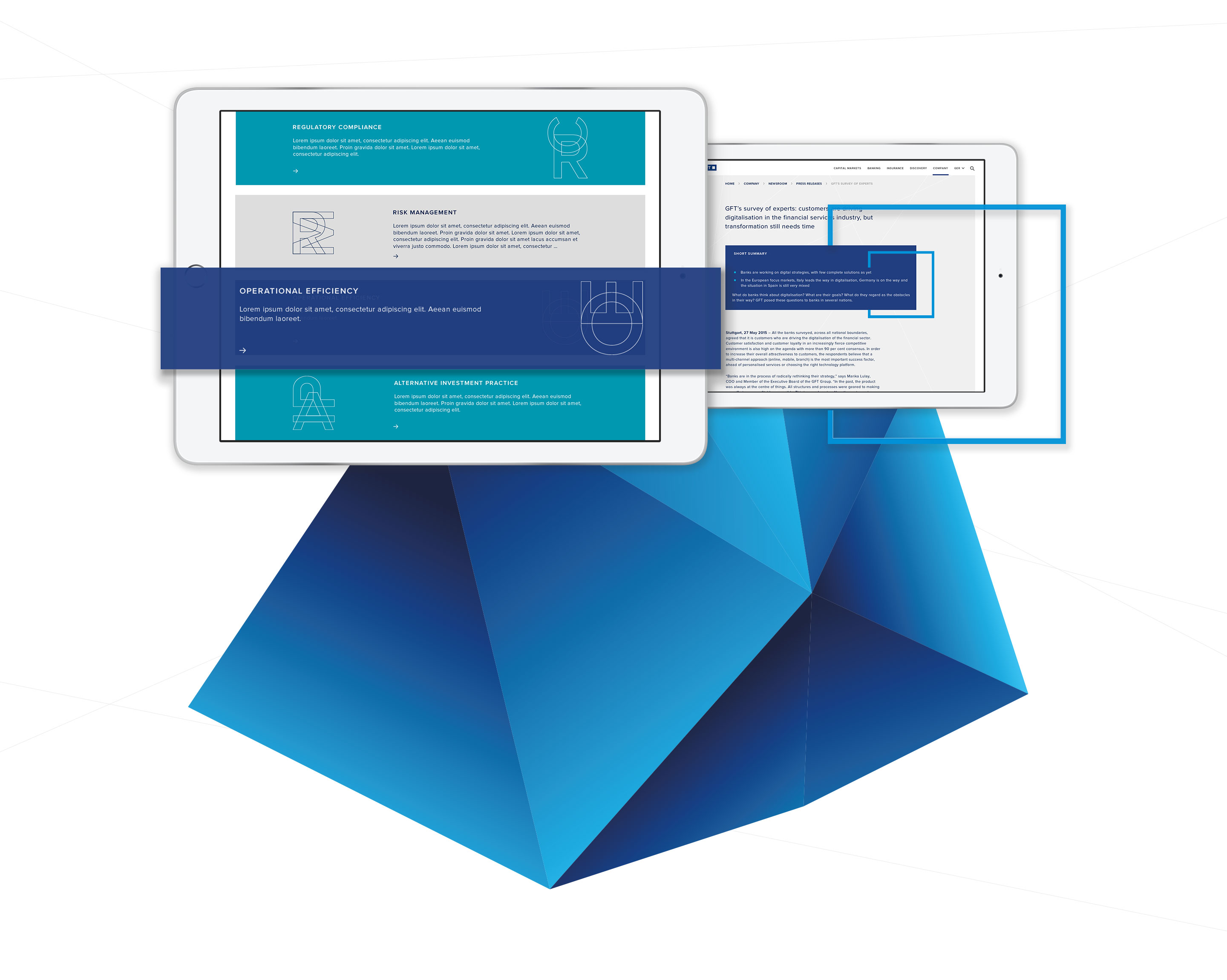
The core graphical element
As with the new key visual, the „line“ as the core graphical element is immanent in the design of the website. It is used in various strengths to define the look and feel of teaser, icons and ornamentation elements. The line gets contrasted by the use of colored areas. The key visual itself is also cited and used. For example in the off-canvas navigation, where the background visual is a blurry version of the polygon.
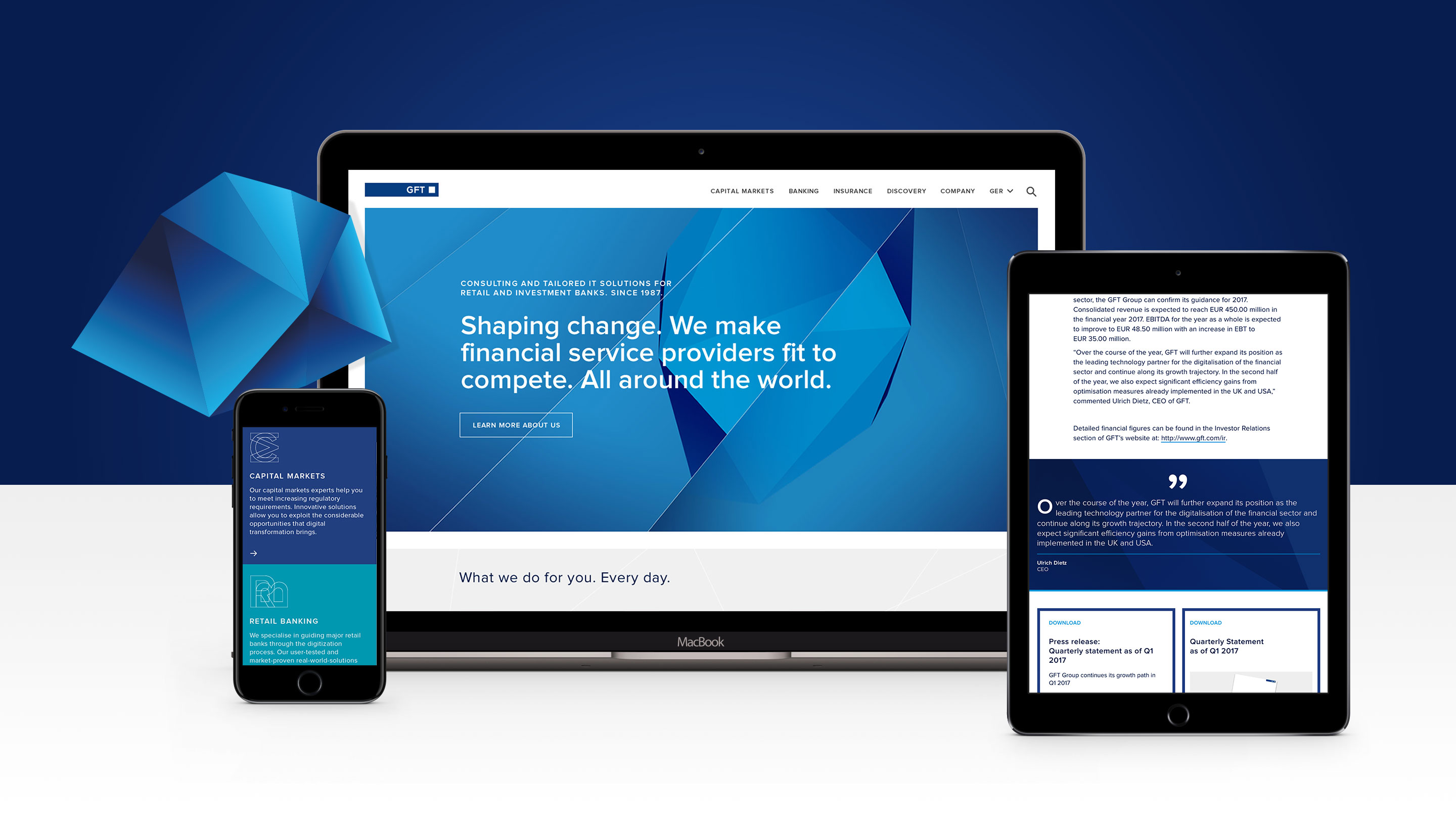
Fully responsive
GFT’s new corporate website is fully responsive. The big touch areas make the website easy to use and guide the user exactly where he wants to go. Different website sections are indicated on mobile devices as well as on desktop screens by contrasting color changes. Since the animated key visual is not played on mobile for reasons of better performance, it is used as a background pattern for various modules and teaser.